Type has personality – but then, most characters do.
Have you ever taken a moment to contemplate the individual characters on a page? They have a personality, and they convey a mood or an emotion.
Each unique typeface provides a tone and an attitude to an otherwise voiceless page. It can shout excitedly, sing sweetly or whisper gently to the reader. And it can put you to sleep or turn your stomach in the hands of an inexperienced designer.
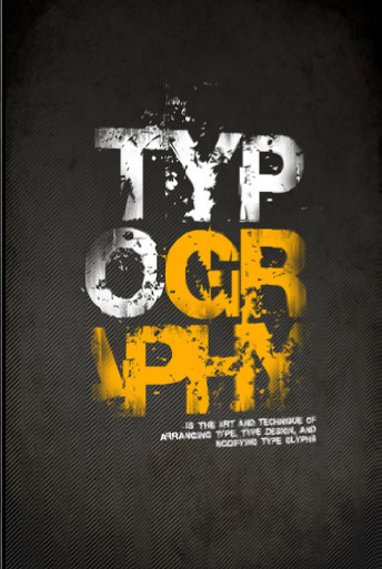
Typography as a design tool
Sure, pictures are worth a thousand words, but words carry the message. Thousands of years ago, only pictures we used to convey messages. Examples range from the pictograms from the caves in Altamira to Egyptian hieroglyphics. However, without written language, it is nearly impossible to understand what these pictures are telling the onlooker. So the type on the page is a vital element of any graphic design.
Typographic style has developed along with printing technology. In the mid-1400s, Johann Gutenberg fashioned moveable type and the printing press. His typography mimicked the hand-written script of the day. His invention created a new industry and helped usher in the Renaissance.
Soon, others began creating new typefaces and styles. The biggest change came when typographers turned to classic Roman letters of antiquity and created the first Roman typeface, known today as the serif face.
Here are some of the typographic lessons learned over the past few centuries:
A capital idea, or is it?
Most books, from paperback to bound volumes, use a typeface known as book weight serif. It is not good practice to use italic, decorative, script or even a bold Roman face in large blocks of copy. Comprehension tests have shown that readability declines when straying from the serif typestyle. And one should never set scripts and decorative typefaces in ALL CAPS.
In the world of type and design, the length of the line is calculated by the size of the type. The general rule is for line length to be no more than 2 alphabets long, or around 50-60 characters in length.
Another way to determine line length is to multiply the point size by 2 (with the type size measured in picas). These rules must be adjusted when using a typeface with a larger height (lines can be longer or leaded more) or with a smaller height such as a delicate script (lines should be shorter). Of course, script or other fancy faces are never appropriate for big blocks of type.
2 Times Point Size (12 pt type = 24 pica line length)
Making it easy on the eyes.
Proper line measure is related to the way people read. The eye makes a fixation ever ¼-second and takes in groups of words, jumping to the next fixation. If the line is too long for the type size, the eye might lose its place when reading down to the next line. On the other hand, line length should not be too short, for it would create letter spacing and word spacing problems in justified text and a bumpy reading experience.
Type readability and legibility
Type readability is the ability to comprehend and identify the written word, sentences and paragraphs with ease. Readers use the shape of the word, in regards to the height, ascenders and descenders, to help identify the word. That’s why lower case is always easier to read than all caps; there is no identifiable and unique shape to a word written in all capital letters.
Additional general typography rules
Reading can be enhanced by using a column width between 39 to 52 characters.
Body copy should be greater than 9 point type and a maximum of 14 point type (depending on age and reading skills of the audience and physical size of the piece).
Leading should be 2 points more than the point size of the type (e.g., 9 point type, 11 point leading).
When using more than one type face, they should be significantly different (e.g., a fancy script and a sans-serif).
Avoid using more than two different type families in a single project
A single typeface can be used with two different styles (e.g., use a light or regular weight with a bold or extra bold weighted font). Try to skip a weight (e.g., light and bold vs. light and medium). When a weight can’t be skipped, the size of the heavier font should be increased.
Never use all caps for body copy
Never use all caps with highly decorative typefaces (e.g., Zapf Chancery).
Use a rule rather than the underline style, which runs through the descenders of lowercase letters. Set the rule to clear the descenders by a least 2 pts.
Guidelines for hyphenation, orphans, and widows
Avoid hyphenating more than two consecutive lines.
Don’t leave orphans! (a word or short line at the top of a column or page).
Avoid widows! (a single word on a line by itself at the end of a paragraph).
Never hyphenate a widow.
Putting boundaries on Justification
Don’t use a short line width with justified text. Large “rivers” through the text will result. A river is a large gap between words that run throughout a block of text and is very distracting.
To adopt a more formal appearance, use justified text (the left and right margins are parallel).
Ensure the column width, the size of the type, and the number of characters per line don’t leave big gaps between words.
Left justified/ragged right to lend a more personal feeling (left margin aligns and the right margin ends at different places depending on the characters/words in the line).
Adjust centered and right-aligned type, use soft returns (keeps lines within the same paragraph) to force line breaks when necessary to make the line lengths noticeably different.
With text wrap, justified text gives a better overall look, but be careful of big gaps between words. Text wrap requires extra work to make it look good including copy-editing to help fit.
The secrets of kerning and spacing
Often, visual gaps between letters or numbers that occur because of the shapes of the adjacent letters (AT, AV, Te, Wa, 11, etc.). To compensate for this visual anomaly, use kerning. Kerning is the removal of incremental space between the offending pair.
Kern type so that the white space between characters is visually equalized. Take the first three letters and visually center the second letter between the first and third letters. Do this for all letters in the word until there are no irregular gaps between letters.
Standardize vertical spacing as much as possible (e.g., spacing between headlines and text, before and after subheads, between paragraphs).
Reduce workspace and tracking (letter spacing) carefully. If the words or letters are too close together they become difficult to read.
Proofing suggestions
Always have someone who did not write the copy, edit the copy.
Always proof your copy of misspelled words.
Always have another person (hopefully literate) proof for typos and inconsistencies in style. (It’s too easy to overlook your own mistakes.)
Remember, spell checkers only catch about 90% of the mistakes.
Remember, spell checkers only check for spelling, not meaning (e.g., two, too, to or even tutu).
Working with text on a background
When reversing type, white or light color, out of a background, the type must be large and bold enough. The minimum size should be 14 points and the type style should be bold. Avoid delicate serif fonts. Avoid ornate patterns. Avoid four-color photographs if the material is going to be printed.
Make sure there is enough visual separation (contrast) between the type and the background. When reversing copy the minimum gray value should be 40%. Contrast, separation, and vibration are all important issues that impact readability.
Check and adjust letter spacing and word spacing within lines, specifically for large gaps between words or letters; then paragraph, column, and page breaks in terms of:
-Kerning
-Hyphenation zones
-Ragged right text
-Right justified text
-Widows and orphans
Some designers study typography for years to become virtuosos of this art. Excellence in typographic designs results in improved readability and copy that exists in harmony with the entire page including photos and illustrations and overall layout.
Want the chance to win $50 in print credit?? We feature a new winner and “What’s Next?” article all the time, so Enter Your Topic Here.

