Recently updated on November 20th, 2017 at 10:56 pm
Discerning people in the business world understand that a thoughtfully-designed letterhead makes a statement. It is a subtle one to be sure, but nevertheless, the letterhead delivers its own message regardless of the words that may be printed on it. Here are a few tips that will help you design a letterhead that reinforces your communications and your brand.
A business needs to communicate to its prospects and customers. This usually begins with a business card presented at an introductory meeting. Often this is followed up with a letter. A letterhead will keep the flow of communication consistent and identifiable. A letterhead will lend credibility and solidity. A letterhead helps establish a sense of dependability and financial stability.
In a time when every company has a website and an email address, the ability to hold a letter imparts the reassurance of tactile sensation while helping to bolster a brand. The person who receives your letterhead should be able to read into your company before a single word is deciphered. Your letterhead must reflect your customers and clients. It must impart a message of “we’re exactly the kind of company you want to do business with.”
Research Competition and Clients
Competition – Seek out letterheads from your competitors. You may decide to be a contrarian and design something completely different, or you may decide to blend in with the majority. Whatever the case, you need to know what your competitors are up to so you can do it better.
Clients – Throughout your letterhead designing process, always keep this in mind: you’re designing for your client, not for yourself or your firm. Your letterhead needs to cater to your customers’ taste, and help them see the true image and benefits of your brand.
Fundamental Factors
Your letterhead is a medium for your company to communicate messages, one sheet of paper at a time. Take these factors into consideration:
Color
Your entire collection of marketing materials needs to act as one unified campaign. The color of your letterhead should be in coordination with your brand colors as well as colors of the rest of your marketing tools.
There are two important aspects you need to keep in mind with your letterhead color: readability and use.
1. Readability
Carefully consider the color of the background and the color of the ink. For most companies, the writing space on a letterhead is white. A light background allows dark ink to be seen easily thereby increasing readability. Dark backgrounds thwart readability. There are exceptions to this rule: it may be appropriate to have a gaudy color combination in some niches, such as party planning or those who provide quirky products and services.
When it comes to ink, neutrals are a wise choice. If you want to be unique, you don’t have to be limited to black ink. Dark gray or brown, dark green or red may be suitable. Paired with a light background, these ink colors will impart readability, while helping you establish a unique brand identity.
2. Use: Copying, Faxing & Printing
Think about how your letterhead will be used. For example, if your letterhead is going to be frequently fed through copy and fax machines, then you do not want to use a dark color, unless you want to end up with a mass of unreadable copies and faxes.
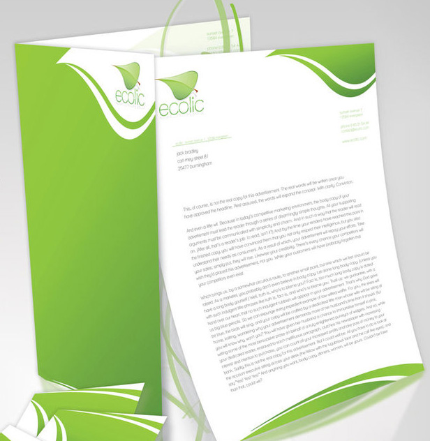
Images and Graphics
When it comes to graphics and imagery, your goal is to communicate your brand, identity, personality and benefits. Your letterhead should include your logo. The placement of your logo is an aspect of design to be carefully considered. Your design and your corporate image will determine where your logo goes on your company letterhead. Centered on the top says traditional – anything else suggests innovation. Don’t forget that your letterhead’s first and foremost function is to communicate. Your design should not get in the way of this mission.
Traditional letterheads have almost never included more than a logo on them in terms of graphics. However, current trends have opened the doors of opportunity to every conceivable visual. Here are some possibilities which may provide direction:
The entire logo, or an enlarged part of it, can be ‘ghosted’ on the sheet.
A watermark can be incorporated into your letterhead. This can be a generic watermark provided by your letterhead printer or one custom made for your company.
An image can be printed on the back of your letterhead paper, which will slightly show through the front and convey a message for your company.
Take advantage of photo-editing, visuals, clip-art and other graphics for decoration. Remember, this will not work for most conventional industries, though it never hurts to try something outside the box.
Typefont
The font, also known as ‘type’, is a key component of your letterhead design. Not only do you want it to be readable, you also want it to convey your brand identity to the reader. Your corporate image may be traditional, or it may be forward-thinking – your font needs to be able to convey that image. Consistency is key when working with font styles. Each piece of your business stationery should use the same type of font. In some cases, it may be acceptable to use more than one font on the same letterhead. If you use more than one typeface on your letterhead, you need to be sure that they all work with each other.
Going Green?
Recycled paper stock deserves serious consideration when selecting paper for your letterhead. A great selection of recycled paper stock is available. This gives you an opportunity to project an environmentally friendly image for your company. Depending on which industry you’re in, a small aspect like using recycled paper for all your stationery [and letting it be known] can set you apart from your competitors.
One Size Does Fit All
The majority of business letterheads are a standard 8½” x 11” in size. Aside from the fact that this size is typically accepted as the standard in the United States, it also allows you ample room to have your logo and all the other elements of your letterhead design on the paper while still leaving room for text. There may be situations where you need to go with a different size paper, though that is not the norm. As you know, the recipient of your message will almost always have the first exposure to your letterhead in a three-fold format when they open a letter from your company.
Want to go upscale? Create a letterhead design which has elements on the back of the paper also, not just on the front. This way, your letterhead will always look distinctive, whether folded or not.
Sources of Inspiration
Now that you know the basics, you should collect some letterheads that you really admire. Look at your competition and see what they’re doing. Get samples from any business whose brand you respect. Get plenty of samples and you’ll start to notice patterns. Observe: fonts that speak to you, colors you think can represent your brand. Your subconscious will develop ideas.
Your Turn!
Translating all this input into a letterhead design which satisfies your intent and purpose is one of the most challenging, yet rewarding, assignments you can accept. Your concept needs to work at many different levels – visually for the eyes, imaginatively for the mind, and rationally for your business. Be bold! You have more freedom than you realize, and properly laying out the basic components as discussed here will lead you to success.
Here are some letterhead designs from over the years that have been used by noteworthy people and companies:
Nikola Tesla, circa 1900. Inventions featured, clockwise from top-left: Oscillation Transformer, Telautomaton (wireless, remote-controlled devices; pictured is a remotely-operated boat, showcased in 1898), Steam & Gas Turbine, Induction Motor. Center: Wardenclyffe Tower (never completed).
In 1967, just a few months after Star Trek debuted on television, the show’s creator – Gene Roddenberry – used this very letterhead for all business correspondence.
Even as early as 1906, Wrigley Chewing Gum was pushing new brands and flavors, as illustrated on this letterhead. Some featured products: ‘Wrigley’s Nips – The new chewing gum with the candy jacket’, ‘Sweet 16 – Assorted Pepsin Gum’, and ‘Wrigley’s Blood Orange Chewing Gum’.
The company was founded 15 years earlier, at which point they manufactured laundry soap.