Recently updated on January 19th, 2018 at 11:59 pm
According to Direct Marketing Association (DMA), 89% of consumers remember receiving marketing flyers, which shows the value of the medium. 45% keep them. However, only 1% of them respond. It takes a proper marketing strategy and a great design, to make sure yours is in that top 1%.
The question is: do you know what will help market your flyers effectively?
Studies show that 90% of the information that comes to the brain is visual. If a person regards something as beautiful, there is a higher chance that he or she will pay attention to it. Flyers are no different.
Most of the time we see flyers posted on walls, distributed by salespeople, in our mail, on the counters of stores, and sometimes, in the trash. If yours ends up in the latter, I’m sure you ask yourself what you did that was so wrong. Why did your flyers end up in a recycling bin?
There are so many facets that make up great design. Did you use the right font? How about the colors and spacing of your design elements? Did you overdo it? Does it convey the right information to your customers? Did it serve its purpose?
Your flyer design is an important factor that may affect the outcome of your marketing campaign. So, if you don’t want your flyers to be thrown away by your potential customers, pay close attention to your designs. The key is to design it in such a way that makes it stand out, catch attention, and get your customers to take action. For some people, this can be easier said than done.
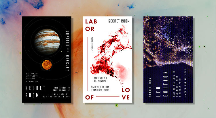
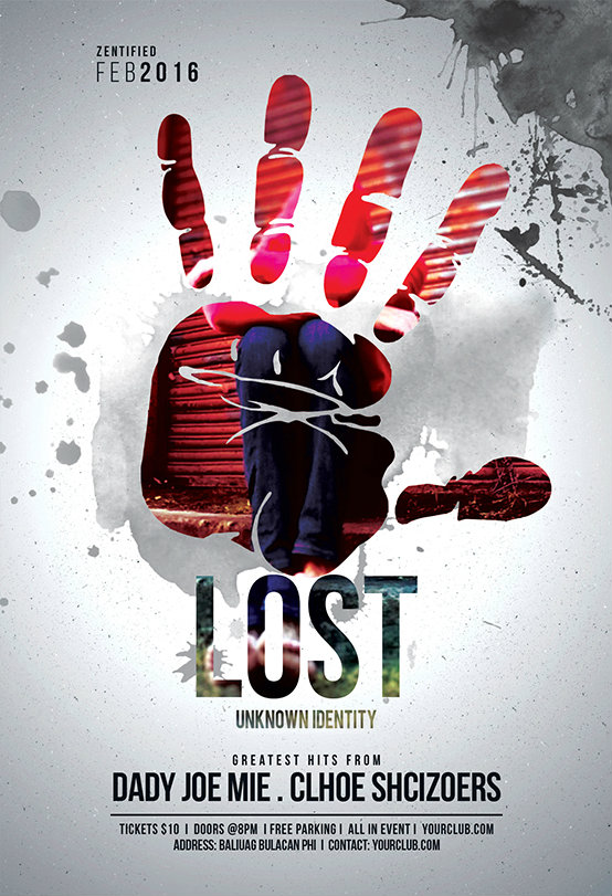
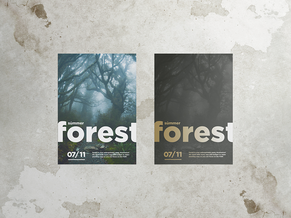
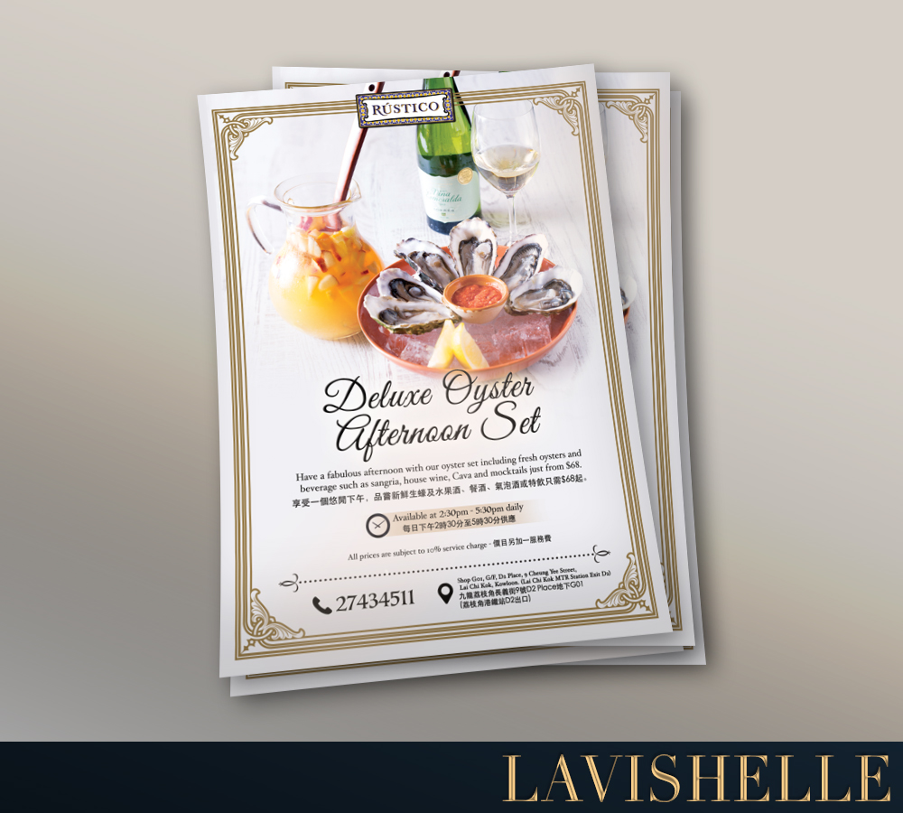
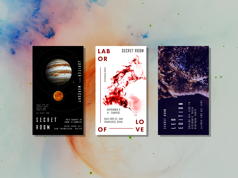
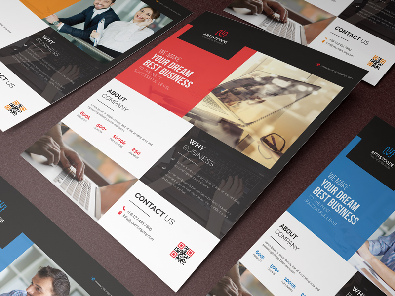
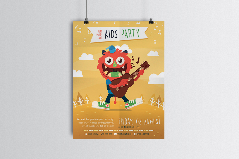
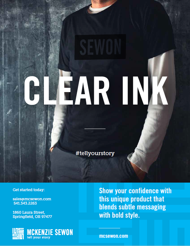
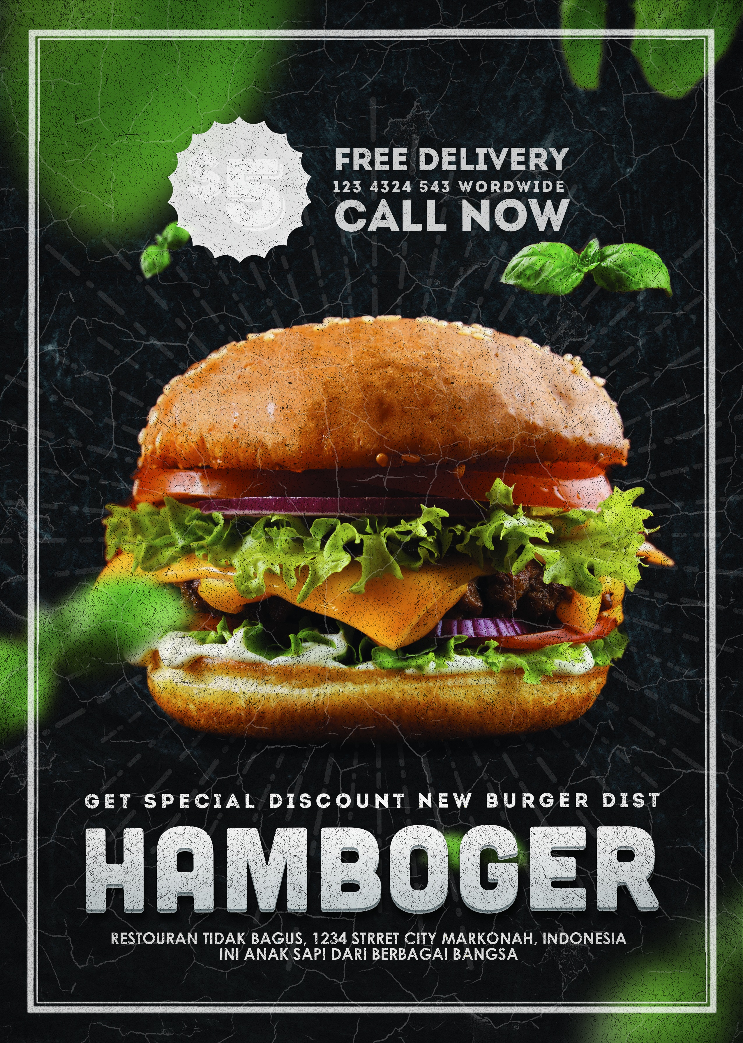
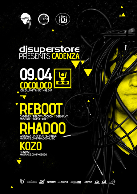
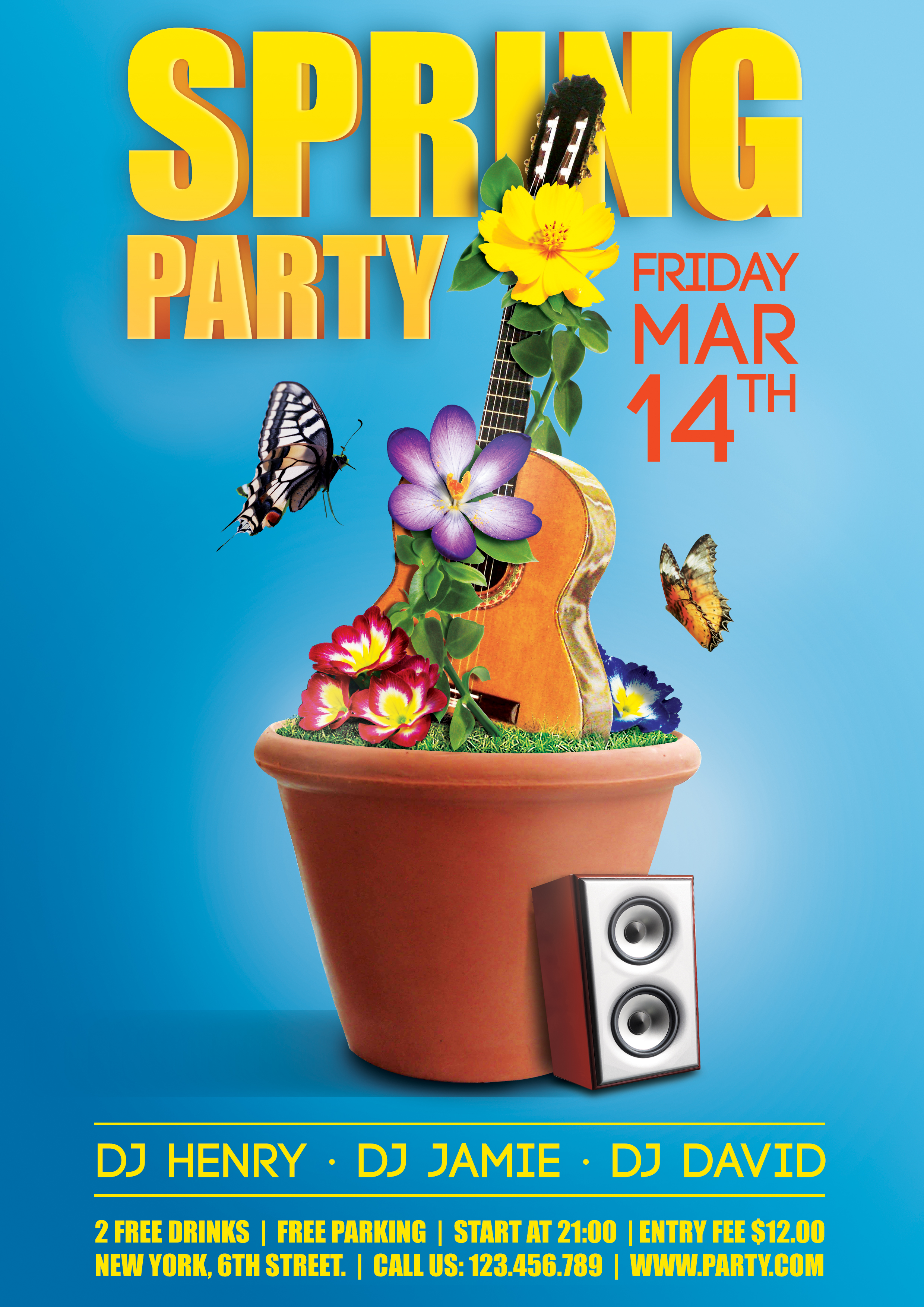
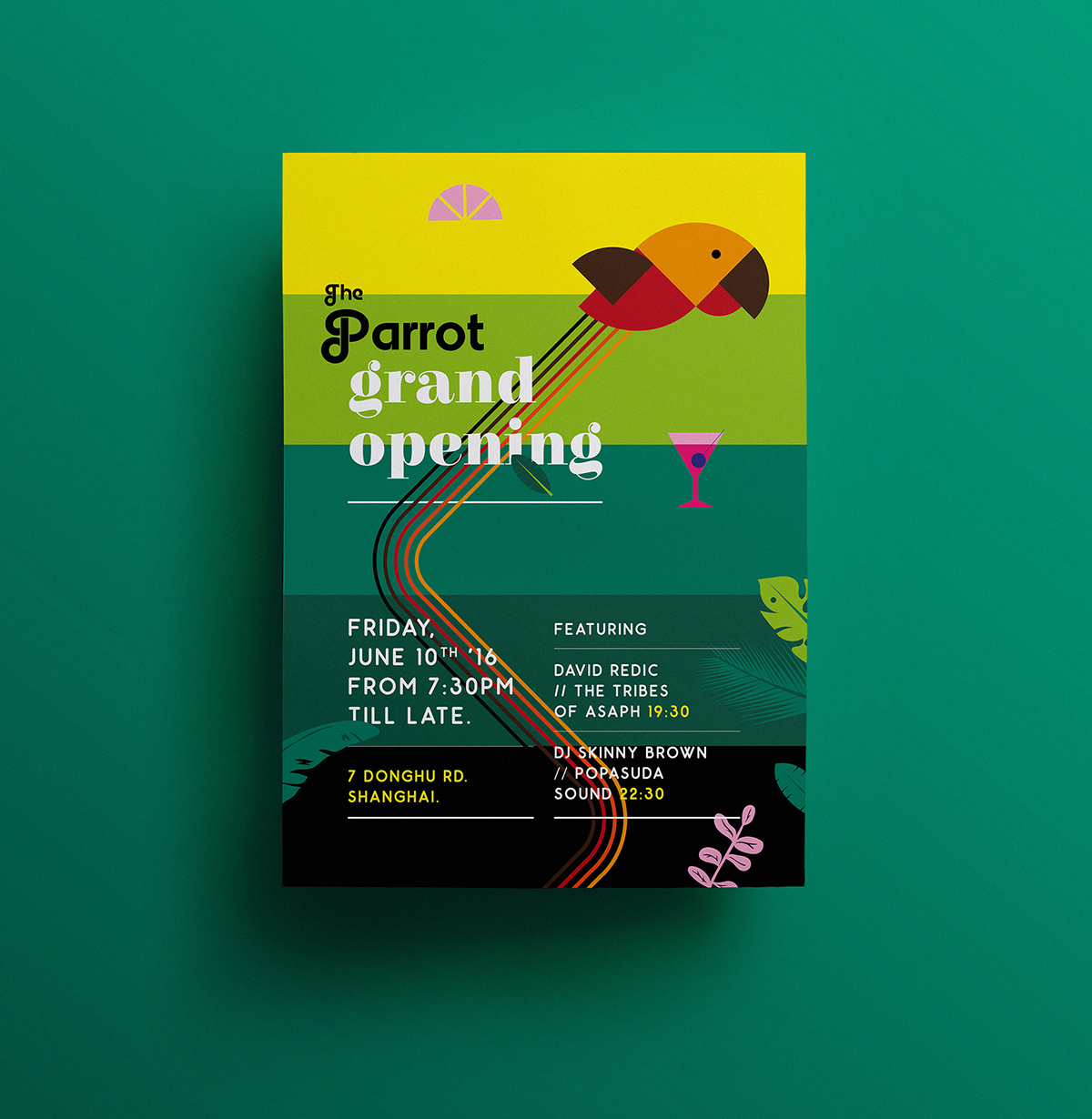
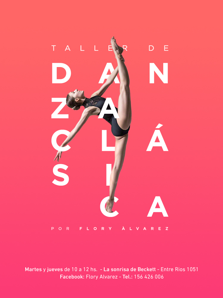
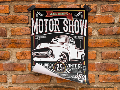
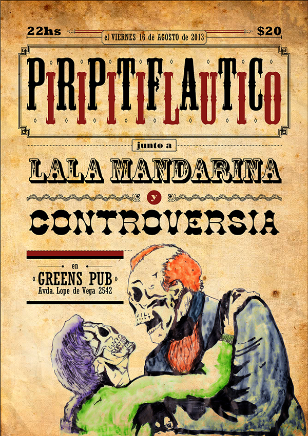
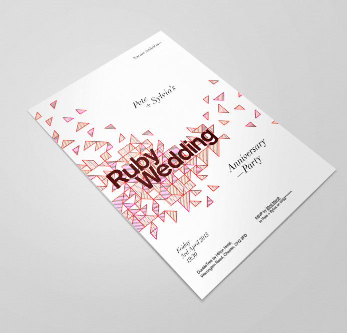
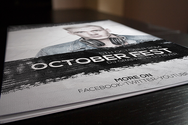
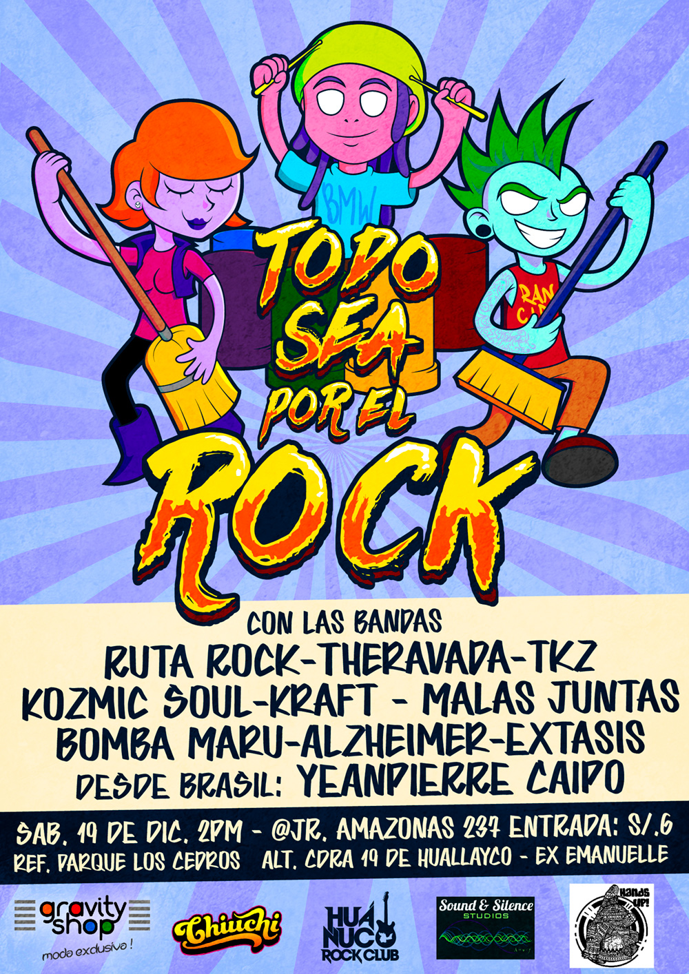
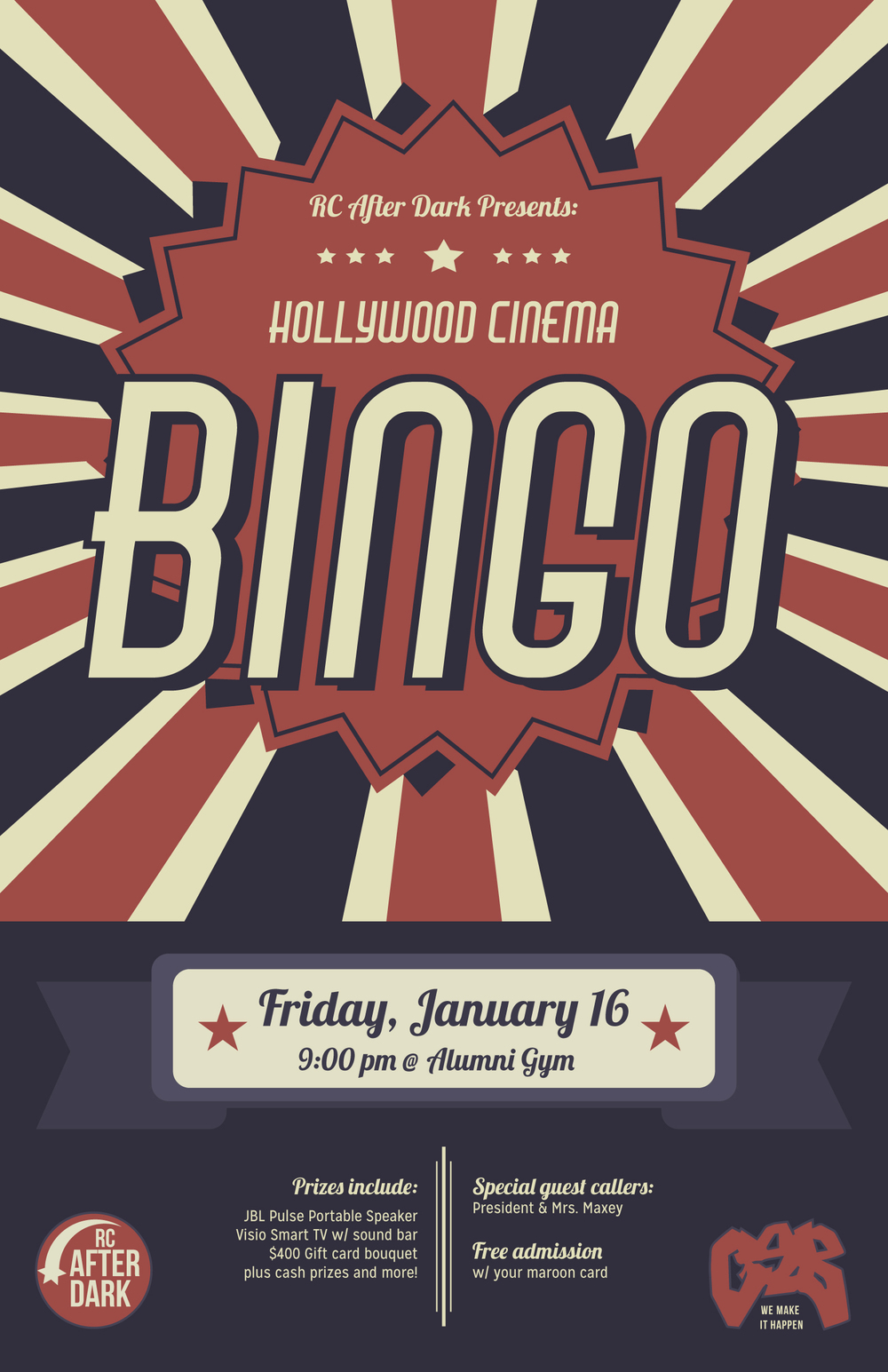
We asked several flyer designers to share some of their tips to inspire you to create your own. We also included flyers that they personally created so you can see what great flyer designs look like:
For me, designing a flyer is like making a coffee in the morning, you need to have your resources and the sense of taste that blends with the needs of your clients or where the flyer will be used . Just go with your passion and spread the good graphics.
Information is most important, and should be straightforward – but in a clever way. Sometimes we want to design the best thing ever, and we forget why we do it. If there are tons of effects, your design might overpower the information that you want to convey.
Set a clear and attractive headline. Proper size and placement of your flyer’s headline is important. The headline should be large and should be one of the first things viewers notice when looking at the flyer. Placing the headline at the top or middle is a common area that people expect to look. The font style for the headline should be one that contrasts with the body text (for example: a serif header font with sans serif body text). Placing ornamental elements around the headline can also help draw attention and create a luxurious appearance.
As I am designing, I am sending out signals to the audience. I try to think of what would catch the target audience’s attention (color, shape, icons, typography, etc.).
I have a 1-second rule for the first moment of contact and a 3-second rule for gathering all of the information on the design. My designs will have 1 second or less to impress the audience. This is when I focus on the main graphic of the design.
If they take a second look, then all of the information should only take 3 seconds for the audience to read. This is when I focus on the copywriting, the typography, and the organization of the information.
Must follow company branding (like brand color, logo concept). Flyer must be clean & eye catching. Must follow flyer category. If you want to design CORPORATE FLYER then you have to know how corporate flyer looks. So google it and search for corporate flyer.
I am an illustrator, so I always tend to create well colored illustrations, the colors are very important (eye catching) and text that blends well to it. Very important to create something unique that shows your style.
Make it bold – along the same lines as above, you have to make sure your flyer stands out. If it’s simple it’s much easier to make it bold. Bold statements, bold images, and bold colors. People are busy. They don’t have time to search you out. Make it effortless to notice your flyer.
Know who you’re designing for – this will affect font, color, and image selection. And, never forget your end goal. This will help establish and keep the overall hierarchy of the flyers.
Design to a grid. How to have too much information in a relatively small space? Use a grid. A grid helps you efficiently utilize the space and making sure that everything is aligned and in place. You may find it hard or constraining but the more you design to a grid, the more you’ll find out how much it’s useful and time-saving.
Sourcing a relevant/appropriate image or images for the subject. Then cropping, using various Photoshop methods if necessary to make visually appealing and interesting. The essential type like headings and dates must be readable, short and enticing. The message must be clear and call the viewer/reader to action, act and directly want to follow the contact information.
I always start the design process by sketching out various versions until I have the basic layout. I create most of the essential elements in illustartor; such as the typography as I feel it (Adobe Illustrator) offers more control, then switch between Photoshop and illustrator to achieve the final result.
Having a plan, sketch or rough idea of how you want your flyer to look ahead of time will save you lots of time and make your flyer project workflow more efficient. It can sometimes take a while to find that perfect image or graphic, especially if you don’t know what you are looking for. Once you’ve gathered all your project assets keep them in a folder or at least in close proximity of one another for quick access.
Don’t be afraid to take advantage of all the design resources the web offers. Maybe you feel you are lacking in artistic skills, having trouble coming up with a concept or don’t have time to design a flyer from scratch. There is a variety of solutions at your fingertips. For example, searching “flyer” on Pinterest is an incredible source of inspiration. Graphic River and Creative Market are chock full of flyer templates and design resources from novice to advanced designers.
Listening to the artist’s music while creating the artwork sets my mood and also the feel of the final artwork. The flyer becomes a combination of the visual line created for the venue and the visual imagery inspired by the artist’s music. Another special situation is when the artist has a recent release, (that he may or may not promote within the event) if possible I take my inspiration or I try to include bits of the graphics in the final artwork.
In my point of view, flyers are technically a visual tool to communicate information. So essentially, an effective flyer is one that manages to convey its intention to the target audience. And I truly believe that people are easily attracted to what they see than what they read by nature.
To design an effective flyer, it’s really helpful to have a very strong and mind-blowing graphic element as the core of your flyer. By mind-blowing, I mean something that’s unexpected, unique, surprising, and makes people curious. Though having a well-put-together headline and copy is important, it’s after you get people’s attention then they start to read what’s written on the flyer.
Never, and I say NEVER, use images in the design downloaded from the internet, especially for free. People can feel when there is not much effort in the design process and copyright issues are serious stuff. I also think that a flyer that uses pictures or illustration made by the designer just for the flyer always give to it a special aura.
Less is more: try to reduce the text to the minimum… Mysterious stuff always awake the explorer spirit that hides inside us, so try to find a good hay to hook the potential clients to drag them on your website or social network pages, where they can have all the information they need.
Probably is just a matter of taste, but I feel to suggest designers to avoid the black external outline of the font, except if you want to advertise a trashy 90’s dance music party.
And the most important in my opinion: leave the design work to a professional. Graphic design is a real job, people spend years of study to become a graphic designer, just being able to use the softwares is not enough to do a good work.
I think in this case the tip would be to keep it simple, when you have only a few elements in your canvas you let some good space for your imagination to grow, and make something creative from those things. The key is to be playful with the basic elements: colors, types and photos; and be able to take full advantage of their particularities.
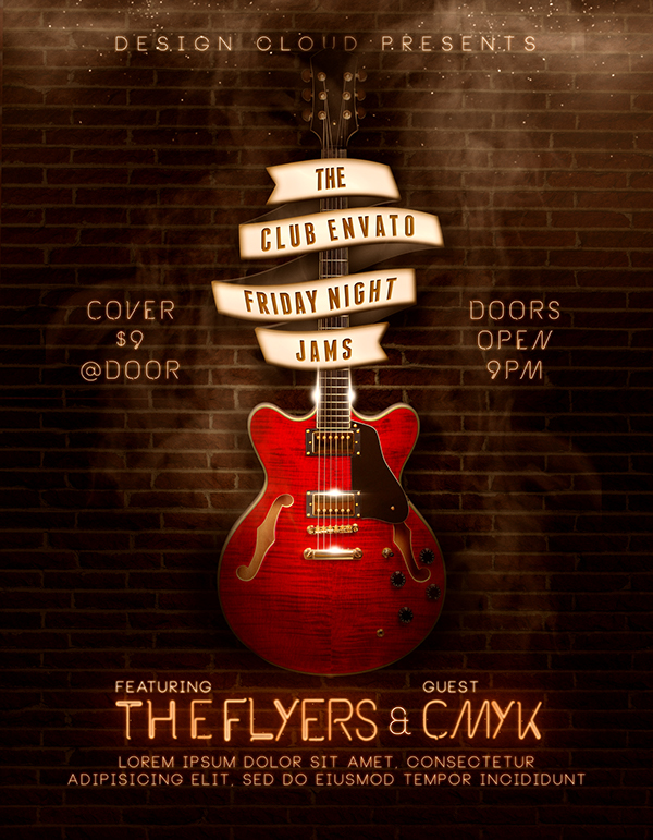
When I am designing flyers, posters or any type of print material I find out what my customer’s focus or purpose is going to be. Then I design a major focal point that conveys the message without even saying any words at first glance. If its a car show i design around an eye catching car or truck, if its a music event I design around an instrument that coveys the type of music (like a guitar for country music), or if its a benefit I design around an iconic symbol. (like the pink ribbon for cancer). A major eye catching focal point will draw viewer in and then allow them to read the content of your flyer or poster.
The construction of most of my pieces starts with a tangled process of looking for a concept, from which all the stuff come. Also I enjoy so much the exploration of new techniques and languages, being as free as I can.
Don’t forget to take hierarchy into consideration. So if you’re designing a flyer for an event the main focus of the flyer should be what the event is, presented in an eye-catching way so that it will grab peoples’ attention. Then, after that would be the finer details presented less prominently, such as the date and location.
A designer is a day dreamer. You gotta let your imagination fly. Be Clever with your colors. Colors create visual harmony. By choosing a warm or monochromatic color combination you will create a tonal foundation for your design.
When designing a flyer one of the important things is to have a good hierarchy in text ( title big & black, copy in a grey color for example). Another one is to mainly use 2 different accent colors. That way, you keep the flyer clean & colorful.
Always look for inspiration, if you are making a design on a rock concert, look for what type of designs that are usually made on a rock concert, trends, etc. And if you regularly download templates, try to change something more than the text or the image, try new colors or perhaps add some new elements, so it won’t be obvious that you used a template.
The first thing that’s super important to me when I design flyers is how it reads, and what kinds of emphasis are on different parts of the information. This depends on content and the theme of what’s being advertised, but when arranging text on the page you should consider how the information will be processed by your reader. Experiment with different orders, sizes, colors, fonts and weights until you find what feels just right.
The second most important thing to me is not being afraid to borrow from others. This happens in two parts for me: research and free-to-use graphics/pictures. A lot of what I work on ends up being time-sensitive one way or another. I do research and collect images that have been created for similar kinds of events, so I have styles, arrangements, colors, and ideas to borrow from. I then troll the internet for freebies that I can incorporate into the design somehow and make my own. This saves time because I almost never start from scratch. The trick I’ve learned is to use only 1 (or 2) resources in a single project and to modify or work around them in a way that makes it look original and professional, not borrowed and patched. Just be careful not to break copyright, of course. There are virtually unlimited places to find free tools online.
Summary:
Most of these designers seem to agree that an effective flyer design must be eye-catching to grab people’s attention without compromising your design. Go bold but don’t overdo it.
Start with a simple concept and build your own design. Make sure that you know the real purpose of each flyer. Typography, scaling, colors and copy are the most important elements of a flyer.
Focus on what your target audience needs and let your creativity flow. If you take all of these into consideration, you can create a flyer that not only is visually appealing, but also receives the response from recipients that you are looking for.
Don’t forget to leave us a comment if you have something to add to these tips and designs.