It would be really easy to write yet another blog post about Comic Sans and Papyrus. How, as designers, we feel like “throwing- up in our mouths” whenever we see someone use Jokerman or Curlz MT in a shop window or on a business card. However, the design world is a world full of bad fonts, and there’s a new generation of bad fonts to be considered.
Here is a list of my personal top 5 popular and hideous new fonts:
Bleeding Cowboys
Okay, so you want to be all “edgy” and “rock’n’roll” so let’s get out the Bleeding Cowboys font as we chug some beers down while listening to Nickelback. He’s a rough, tough, modern-day outlaw of a font who gets wasted at parties and tries to hit on your girlfriend!? But there’s a soft side to Bleeding Cowboys too! Underneath the grungy font exterior, he believes he’s a smooth and sophisticated dude with his handsome swirls and frills! (He may think that’s the case, but Bleeding Cowboys is clearly deluded!)
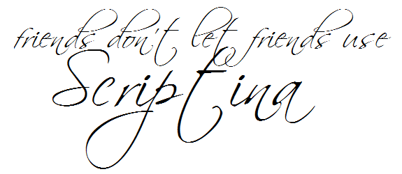
My name is Scriptina. I am a 40 year-old cougar and self-professed “fashionista” font. Please love me!! Please stare at my strange and beautiful handwritten style. I think of myself as an ostentatious, artistic, and scrumptious bit of script that represents “easy elegance” and “sophistication” (In reality, I’m more like a confusing, half-intoxicated mess of unreadable swirly- curly-whirliness!)
To be honest, this new-generation of handwritten script hasn’t improved much on the Mistral and Brush Script nightmares of yesteryear! It’s so unnecessarily condensed and difficult to read? It’s about as sophisticated as an eighties perm!
I’ve stumbled across three different variations of this same grunge font:
Origin of a Hero
Aristotle Punk
The Maple Origins
These fonts are all unapologetic abuses of Avant Garde Gothic. Come on people! Let’s stop destroying perfectly good fonts just to use on emo band covers! I realize that all emo bands are slightly different variations of the same band, but let’s not apply the same rules to our font design! I’m not a fan of grungy and destroyed fonts but you could at least take your big, clumsy, destructive design mallet to a font of your own making!
The Olympic Games is the oldest and most important sporting event in the world! A time for countries to set-aside their differences and peacefully settle their disputes in games of strength and agility. With this in mind, it was someone’s bright idea to represent the auspiciousness and reverence of these games with a font that reminds us of a London kebab shop!
I understand that the designer of this font wanted to represent “fun” and “dynamic” but this font is so crude, disorganized, and ugly! What were they thinking? Let’s celebrate the world’s most important sporting event with bad cartoon graffiti?!
“No sir! It’s just such a terrible design! The font they used really sucks!!”
Will someone please save us from “themed” fonts! This has got to be one of the world’s worst themed fonts. Mostly due to the fact that it looks so false and amateurish (I would hope that serious designers would never consider using this pseudo-font.) The biggest problem with Ransom Note is in the reason and intent. It’s trying very hard to be all dangerous and “punk rock” but fails in a really counterfeit, plastic version of the Jamie Reid (Sex Pistols cover) original.
I’ve been seeing this font for a fair few years and it makes me cringe. My advice to any designer, who wants to recreate this design-style, is to get the scissors and glue out and make your own typographical homage to 70’s punk rock.
This completes my personal list of eye-offensive fonts. I would love to hear your thoughts on these worst font choices! Maybe you have your own list, or maybe you would like to defend one of these fonts? It’s just design. It’s all entirely subjective!
Ha! I love this post! You couldn’t be more right about Bleeding Cowboys! That font is a design nightmare. I love your description of it. I had a client who has a bar in Florida who specifically requested that font on all his menus, flyers, and other stuff. I almost cried having to design using that font! It is my most hated font EVER!
Gotta love the variation. Imagine if all we had was Arial and Verdana…. Allowing people go down the creative path, wherever it may lead, may sometimes give rise to a gem!
Nevertheless, the Scriptina commenting was hilarious!
and loved the sample text also!
ben – this post is so great. its very difficult for a layperson such as myself to properly put into words why a font is awful – but you are like the roger ebert of font critique! Especially love the Cougar font description – spot on!
Great write up! lol. Sample text was awesome, and painful to read!!
Every time I see Scriptina used on a web design, my eyes cross. It is so overused. And I say this as someone who did use that font when I first started blogging and before I learned how to design.
Ever notice that after you become a designer, you can pick out the fonts used on practically anything? It drives my husband nuts. LMAO
I certainly can, Shan. It’s called “fontspotting”. The activity is not quite as nerdy as “trainspotting” and is far more entertaining (it has been known to keep graphic designers occupied for hours and has also been the subject of many a fight-to-the-death between deadly factions of the “swiss school” and dangerous elements of the “helvetica brotherhood”)
Wow, you did a good job on your blog post.
Thank you Joann. Please feel free to comment on our other posts that interests you as well.

 It would be really easy to write yet another blog post about Comic Sans and Papyrus. How, as designers, we feel like “throwing- up in our mouths” whenever we see someone use Jokerman or Curlz MT in a shop window or on a


Ha! I love this post! You couldn’t be more right about Bleeding Cowboys! That font is a design nightmare. I love your description of it. I had a client who has a bar in Florida who specifically requested that font on all his menus, flyers, and other stuff. I almost cried having to design using that font! It is my most hated font EVER!
Gotta love the variation. Imagine if all we had was Arial and Verdana…. Allowing people go down the creative path, wherever it may lead, may sometimes give rise to a gem!
Nevertheless, the Scriptina commenting was hilarious!
and loved the sample text also!
ben – this post is so great. its very difficult for a layperson such as myself to properly put into words why a font is awful – but you are like the roger ebert of font critique! Especially love the Cougar font description – spot on!
Great write up! lol. Sample text was awesome, and painful to read!!
Every time I see Scriptina used on a web design, my eyes cross. It is so overused. And I say this as someone who did use that font when I first started blogging and before I learned how to design.
Ever notice that after you become a designer, you can pick out the fonts used on practically anything? It drives my husband nuts. LMAO
I certainly can, Shan. It’s called “fontspotting”. The activity is not quite as nerdy as “trainspotting” and is far more entertaining (it has been known to keep graphic designers occupied for hours and has also been the subject of many a fight-to-the-death between deadly factions of the “swiss school” and dangerous elements of the “helvetica brotherhood”)
Wow, you did a good job on your blog post.
Thank you Joann. Please feel free to comment on our other posts that interests you as well.
Haha, I love the Ransom Note font!